

🎨 Building Custom SVG Tooltips in Power BI Cards


🚀 What You’ll Learn
In this tutorial, you’ll learn how to take your Power BI visuals to the next level using SVG (Scalable Vector Graphics) inside a Card visual.
We’ll build a dynamic “Regional Tooltip” that displays Sales, Profit, and Margin metrics with color, dividers, and rounded corners — all driven by DAX!
💡 Why use SVG in Power BI?
Power BI visuals don’t natively support multi-line formatting or layout styling in text-based visuals like the New Card visual.
SVG is a game-changer because it allows you to:
Add colors, shapes, icons, and layout control
Format text precisely where you want it
Create dynamic, data-driven visuals without custom visuals or images
Keep everything in one DAX measure
🧱 Step-by-Step Guide
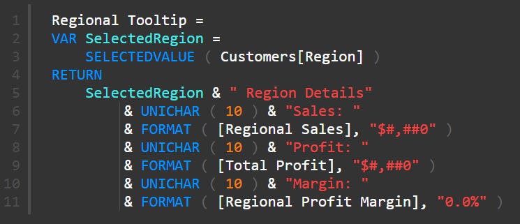
1️⃣ Create the base DAX measure
Start with a text-based tooltip to confirm your values:
If you try to show this in the new Card visual, you’ll notice — no line breaks 😬
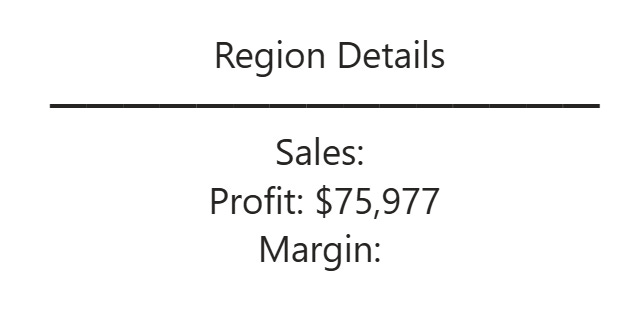
You can’t use any justification, like left justified.
That’s where SVG comes in.
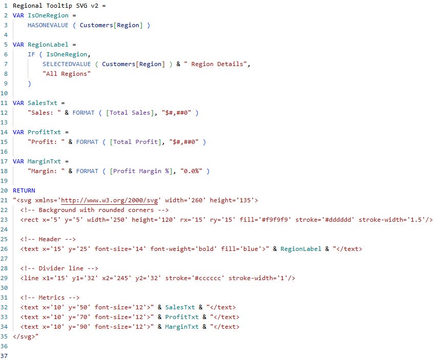
2️⃣ Switch to an SVG measure
Use the SVG syntax directly in DAX. SVG works by drawing elements (like text or shapes) at exact positions. Each piece of data is placed with an x/y coordinate.
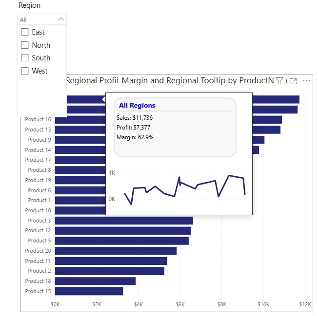
3️⃣ Add dynamic logic for region selection
We want:
If one region is selected → show “RegionName Region Details”
If no region selected → show “All Regions” with total metrics.
VAR IsOneRegion = HASONEVALUE(Customers[Region])
VAR RegionLabel = IF(IsOneRegion, SELECTEDVALUE(Customers[Region]) & “ Region Details”, “All Regions”)
4️⃣ Combine layout and data
We use standard SVG tags:
<rect>→ for background and rounded corners<text>→ for labels and numbers<line>→ for the dividerfill,stroke, andfont-weightfor styling
5️⃣ Display in Power BI
To show this visual:
Add the HTML Content visual (or Table / Matrix if you want multiple rows).
In the Values section, choose your new
Regional Tooltip SVGmeasure.Under Data category, set it to Image URL.
✅ Power BI now renders your SVG as a clean, data-driven mini card!
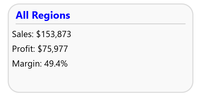
✨ Result
Your new tooltip now features:
A blue header with the selected region name
A light gray divider for separation
Cleanly formatted metrics (Sales, Profit, Margin)
A rounded background box for modern polish
When no region is selected, it gracefully switches to show All Regions totals. 🙌
🔧 Customization Ideas
You can easily enhance this:
Add icons with
<circle>or<path>Change background colors dynamically by performance
Use DAX measures to drive conditional colors (e.g., red margin if below 10%)
Dynamically color the background by margin performance
Add icons using
<circle>or<path>Insert sparkline trends with
<polyline>Use team or product color themes
The possibilities are endless once you start using SVG in Power BI.
💬 Wrap-Up
This approach merges DAX logic + SVG styling to unlock creative storytelling right inside Power BI — no external visuals, no coding outside the platform.
SVG opens the door for:
Branded cards
Visual tooltips
Data-driven infographics
At DataAxe, we help teams build these kinds of smart, storytelling visuals to make data pop with purpose.
🔗 Call to Action
If you’d like to:
Learn how to create advanced visuals like this one
Or get a customized Power BI template for your team
👉 Visit www.dataaxe.net/en-us
📩 Or connect with me on LinkedIn to join my Power BI newsletter!