

Creating a Customized Bar Graph Visualization in Deneb
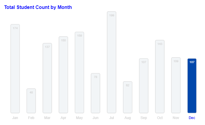
Highlighting the current month bar and the month name

Introduction
Welcome to our latest newsletter! In this edition, we will walk you through creating a customized Vega-Lite visualization in Deneb. We’ll highlight the last month of the year and make specific stylistic adjustments. Let’s dive in!
I wish the product developers at Microsoft for Power BI could add custom formatting for the axis like you can in Deneb. But maybe someday.
Before we start, make sure you have the Deneb visual download from the AppSource in Power BI. It will look like this.
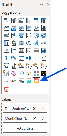
Next for this visual add your DAX measures. In this case, it is Total Student Count and Month Short Name.
Let’s proceed. In Deneb, the code is in a JSON format. I will not go into detail about JSON in this newsletter but will provide you with some basic definitions.
Step-by-Step Instructions with Detailed Explanations
1. Define the Schema First, we start by defining the schema for our Vega-Lite visualization. The schema provides the structure and rules for our JSON code.
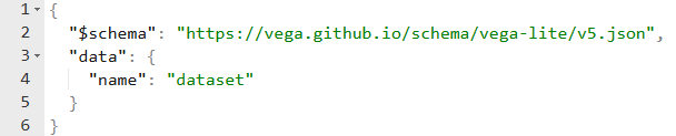
$schema: Specifies the URL of the Vega-Lite schema. This tells the Vega-Lite parser which version of the schema to use.
data: Defines the data source for the visualization. In this case, we use a named dataset.
Keep reading with a 7-day free trial
Subscribe to DataAxe’s Newsletters to keep reading this post and get 7 days of free access to the full post archives.