

Using a Disconnected Table for Year Selection and Dynamic Bar Coloring in Power BI

When building reports in Power BI, allowing users to dynamically interact with the data often requires creative solutions. A common approach involves using a disconnected table for slicers, which offers flexibility in driving custom logic without directly impacting the data model. This article will demonstrate how to implement a disconnected table for year selection and use it to control the color of bars in a bar chart dynamically.
What is a Disconnected Table?
A disconnected table in Power BI is a table that does not have a relationship with other tables in the data model. Instead, it acts as a standalone entity used for slicers, filters, or parameter-driven measures. This allows you to:
Add custom filtering logic via DAX.
Avoid relationship conflicts or ambiguities.
Enable what-if scenarios or parameter-driven calculations.
In this example, we will:
Create a disconnected table for year selection.
Use the selected year to dynamically highlight bars in a bar chart.
Step 1: Create a Disconnected Table
To create a disconnected table for year selection, follow these steps:
Open Power BI Desktop.
Go to the Home tab and click Enter Data.
Write this measure: Slicer Year = VALUES( Dates[Year] )
Name the table
Slicer Yearand click Load.
This table will now appear in your data model but will not have any relationships with other tables.
Step 2: Add a Slicer
Drag the
Yearcolumn from theSlicer Yeartable onto the canvas.Convert it to a slicer visual.
Format the slicer as needed (e.g., dropdown or horizontal layout).
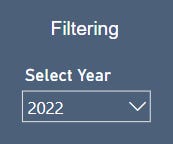

Now, users can select a year from the slicer without directly filtering the data.
Step 3: Write the Bar Coloring Measure
To dynamically control the color of bars based on the selected year, use the following DAX measure:
Bar Color =
VAR SelectedYear = SELECTEDVALUE('Slicer Year'[Year])  -- Get selected year
VAR CurrentYear = MAX('Dates'[Year])  -- Get the year for the current bar
RETURN
    IF (
        NOT(ISBLANK(SelectedYear)),  -- If a year is selected
        IF (
            CurrentYear = SelectedYear,  -- Highlight if current year matches selected year
            [Color Slate Gray],  -- Blue color for selected year
            [Color French Gray]   -- Grey color for non-selected years
        ),
        [Color French Gray]  -- Default color (grey) if no year is selected
    )
Explanation of the Measure:
SelectedYear: Captures the year selected in theSlicer Yeartable.CurrentYear: Captures the year associated with the current bar in the visual.Logic:
If a year is selected and matches the current year, the bar is highlighted in a specific color (e.g., slate gray).
If the current year does not match the selected year, it is shown in a neutral color (e.g., French gray).
If no year is selected, all bars are displayed in the default neutral color.
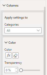
Step 4: Apply the Measure to the Bar Chart
Create a bar chart visual using your data (e.g.,
Yearand Month on the x-axis and a measure likeTotal Saleson the y-axis).In the Format Visual pane, navigate to the Columns section.
Click the fx button to conditionally format the bar colors.

Set the formatting field to the
Bar Colormeasure and apply it.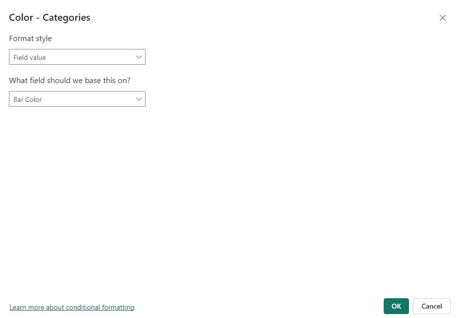

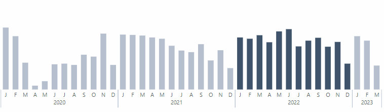
Step 5: Test the Interaction
Select a year from the slicer.
Observe the bar chart:
The bars for the selected year will be highlighted in the specified color.
Bars for other years will remain in the default neutral color.
If no year is selected, all bars will appear in the neutral color.
Why Use a Disconnected Table?
Using a disconnected table for the year slicer provides several benefits:
Custom Logic: The slicer influences only the measures, allowing for advanced customizations without altering the underlying data relationships.
Avoid Relationship Complexity: Keeps the model simple and avoids ambiguity in cases where multiple tables have date or year columns.
Flexibility: You can expand this approach to include other scenarios, such as highlighting based on different dimensions or combining multiple slicers for complex filtering logic.
Conclusion
Disconnected tables are a powerful feature in Power BI for enabling dynamic, parameter-driven logic. By combining them with measures like Bar Color, you can create highly interactive and visually engaging reports. This technique not only enhances the user experience but also gives you full control over how slicers influence the visuals.
Start using disconnected tables today to unlock new possibilities in your Power BI reports!